Rebranding Mountain Bike Shop


Simon’s Bike Shop is a well-established business since 1986, in Downtown Vancouver. Offering customer
orientated service, with a
strong family atmosphere, a variety of services.
These includes rentals, sale, repair, specialized
in Mountain biking and offering
products like mountain bikes, e-bikes, scooters, and trainers.
What I did?
I was tasked to conceptualize a rebrand for Simon’s Bike Store located in Vancouver, which has been in business for almost 40 years.
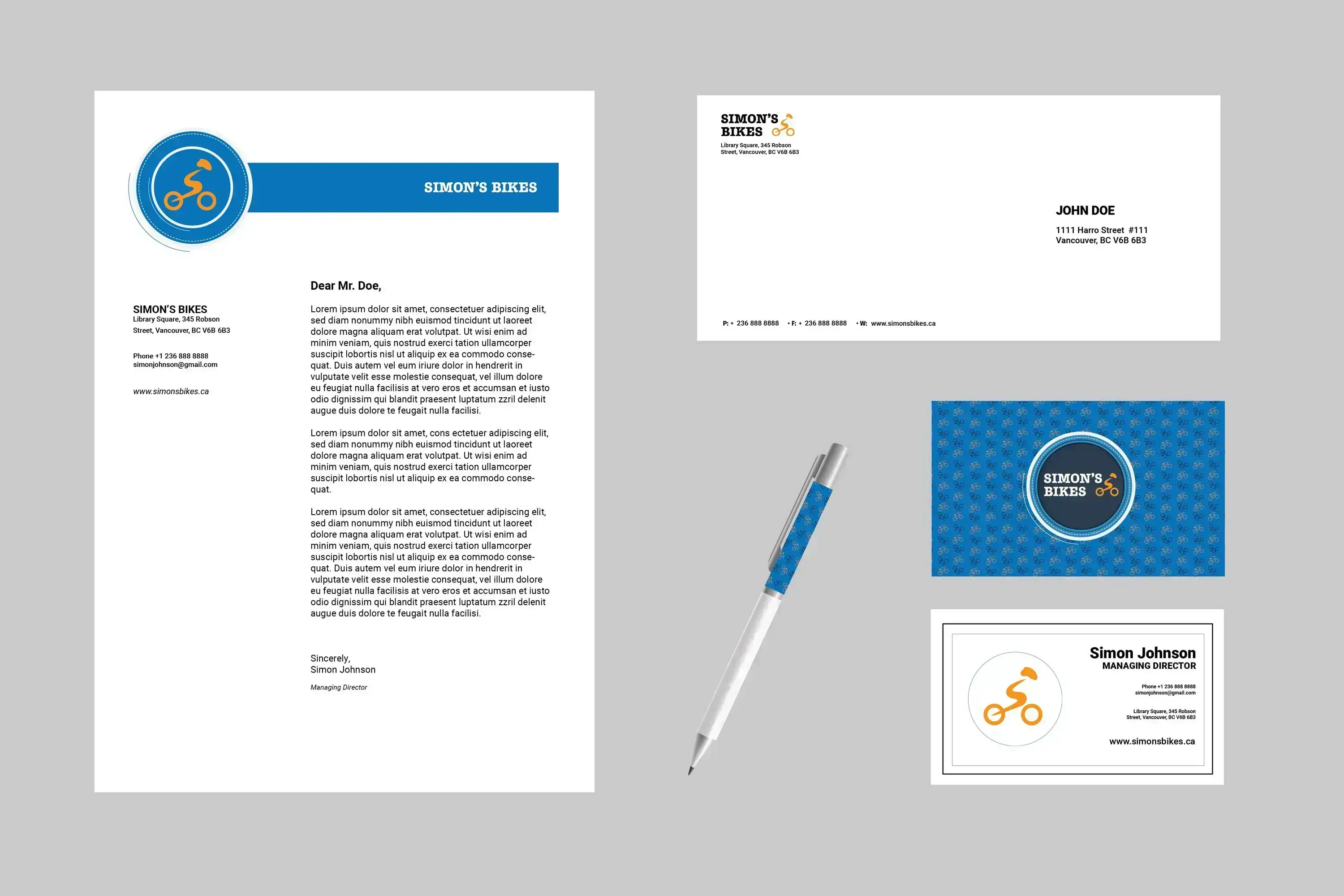
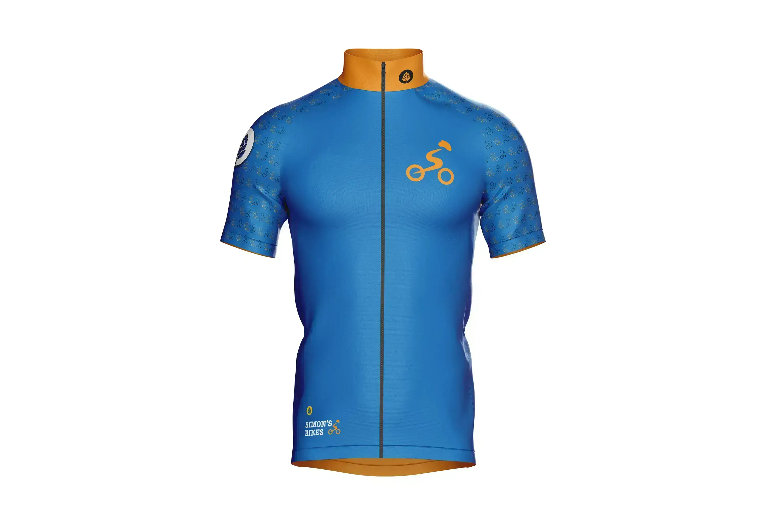
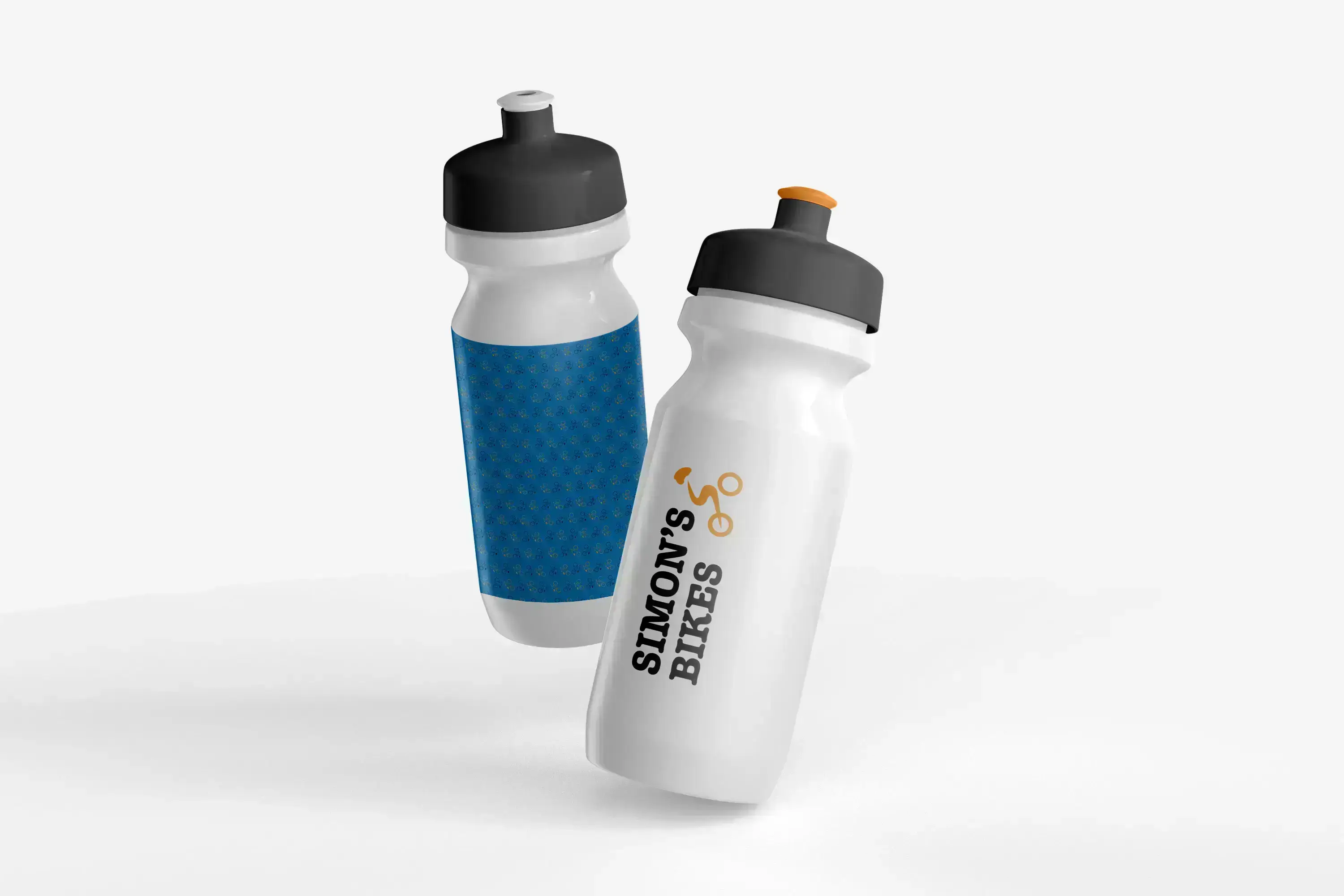
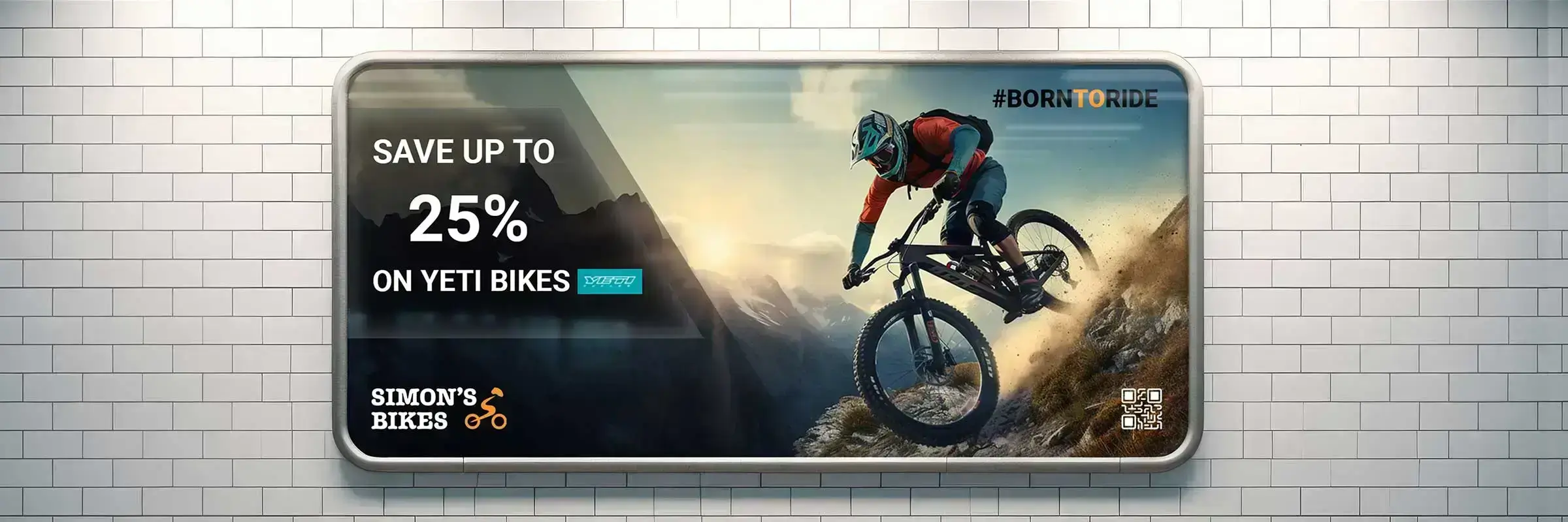
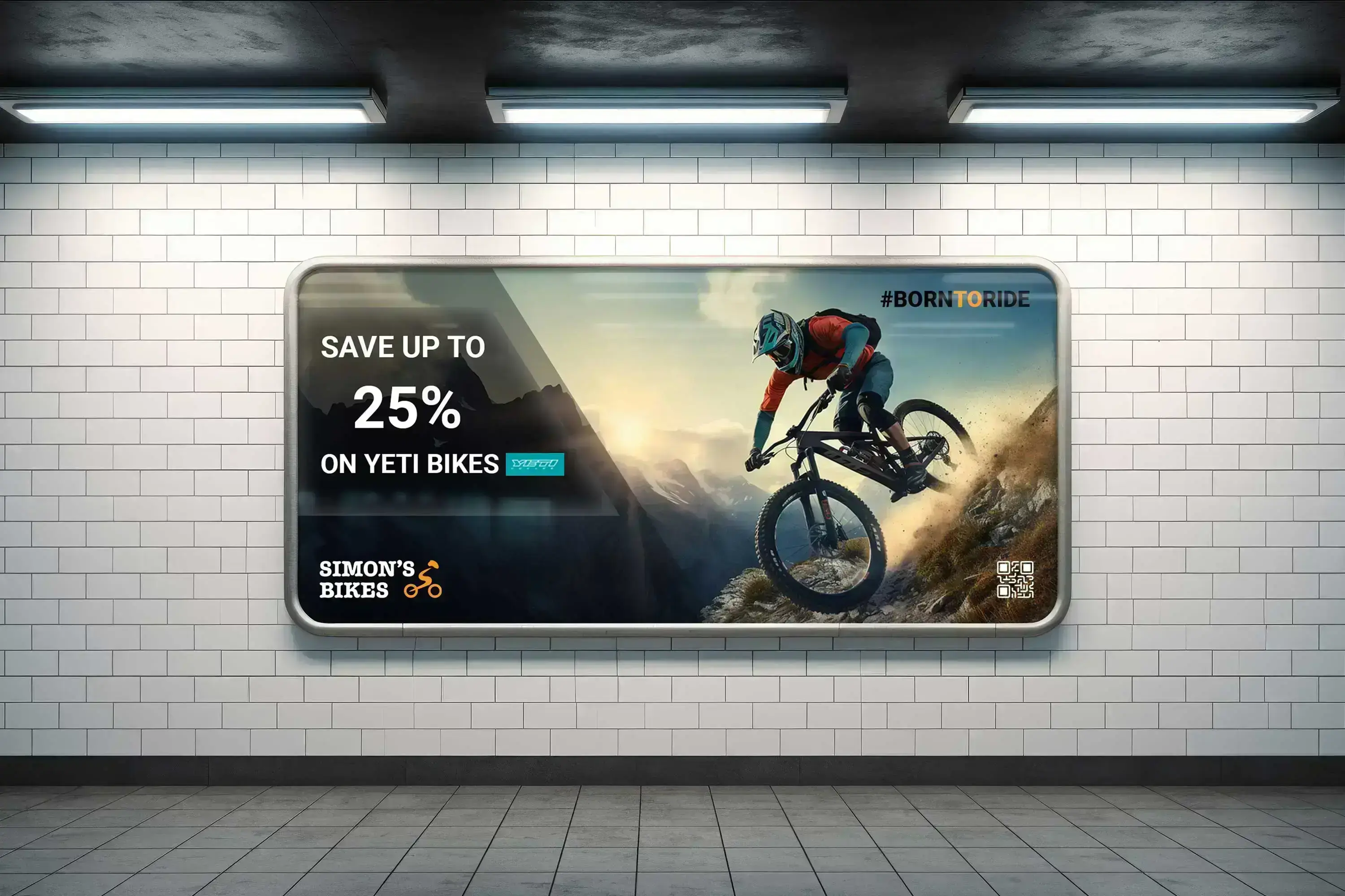
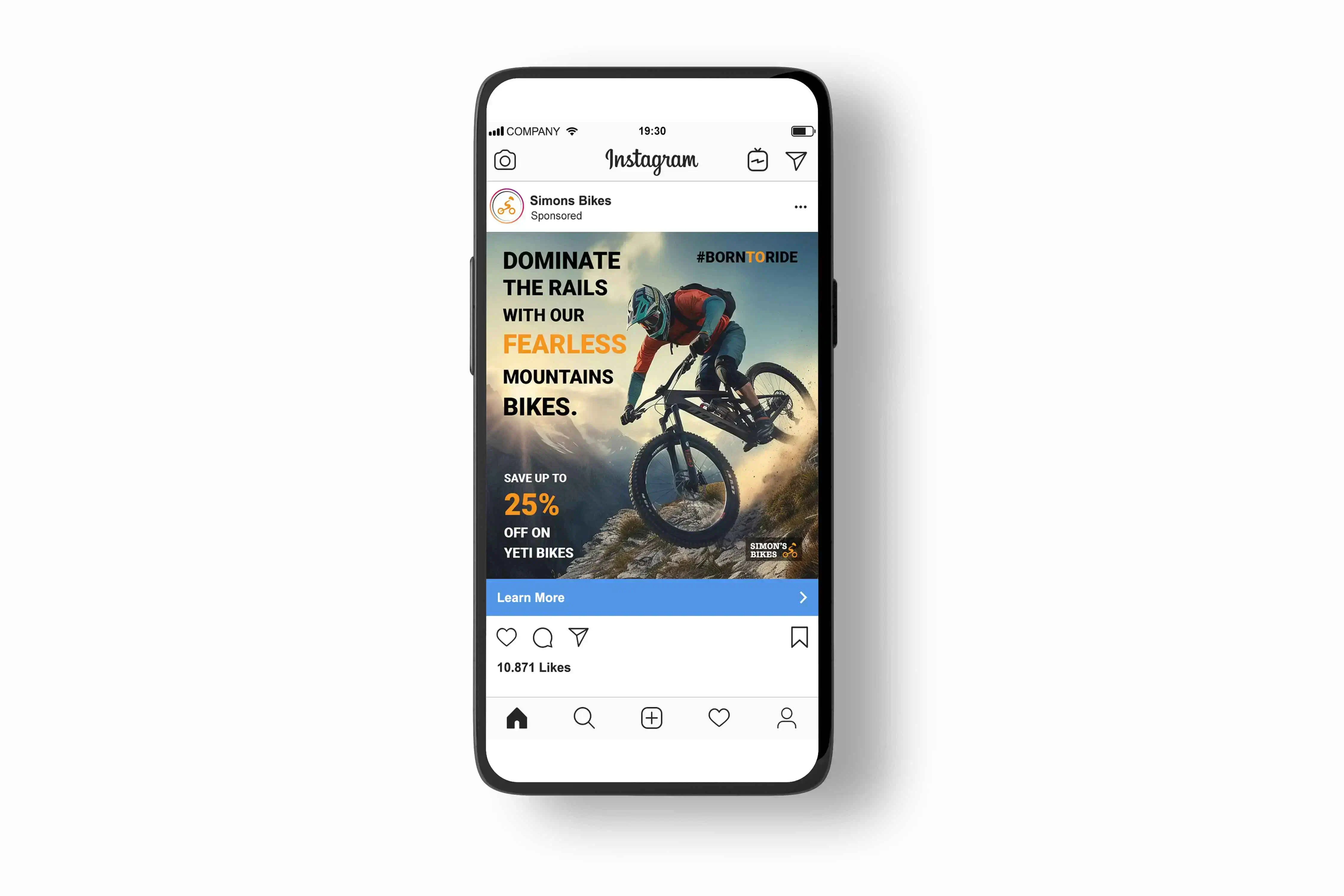
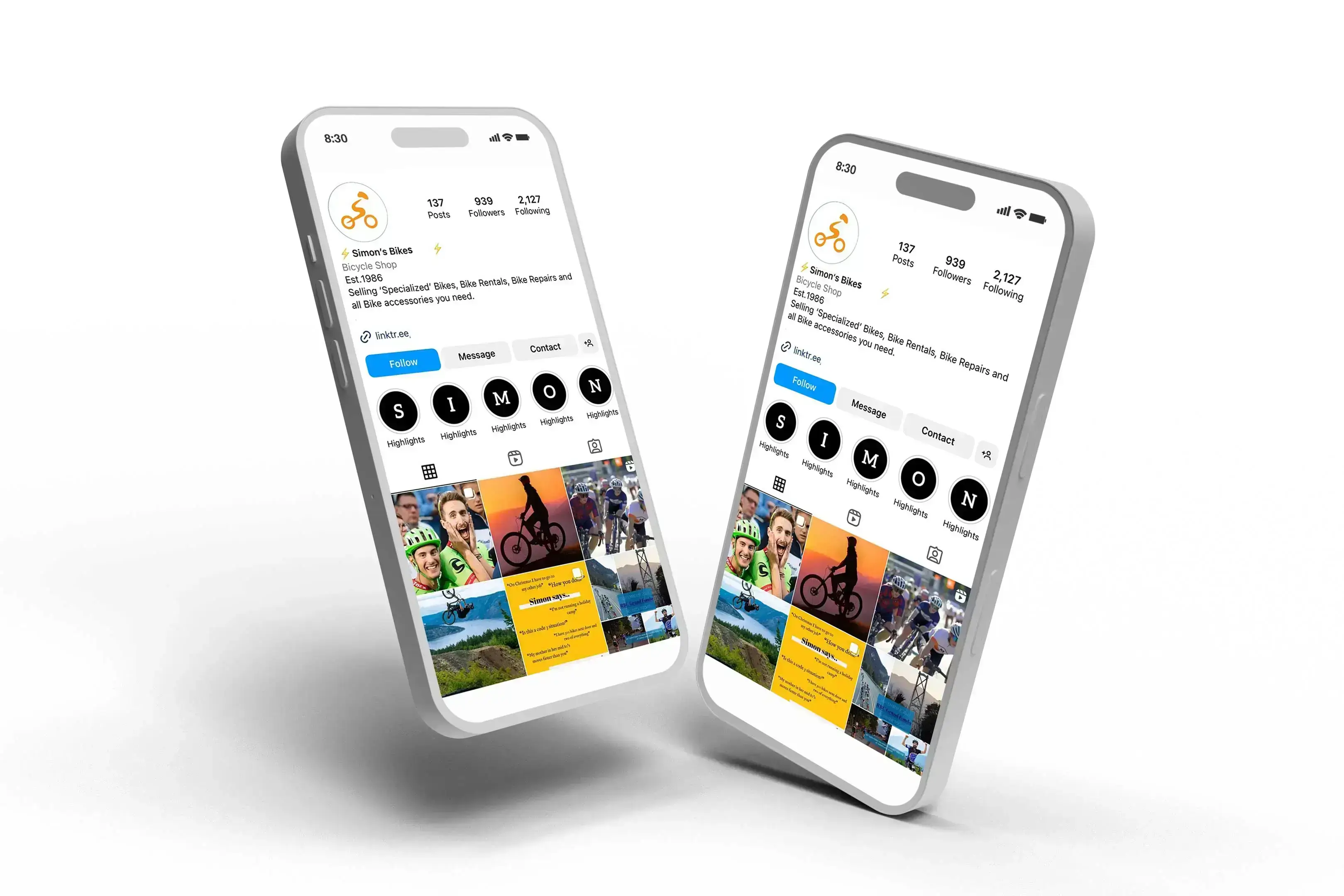
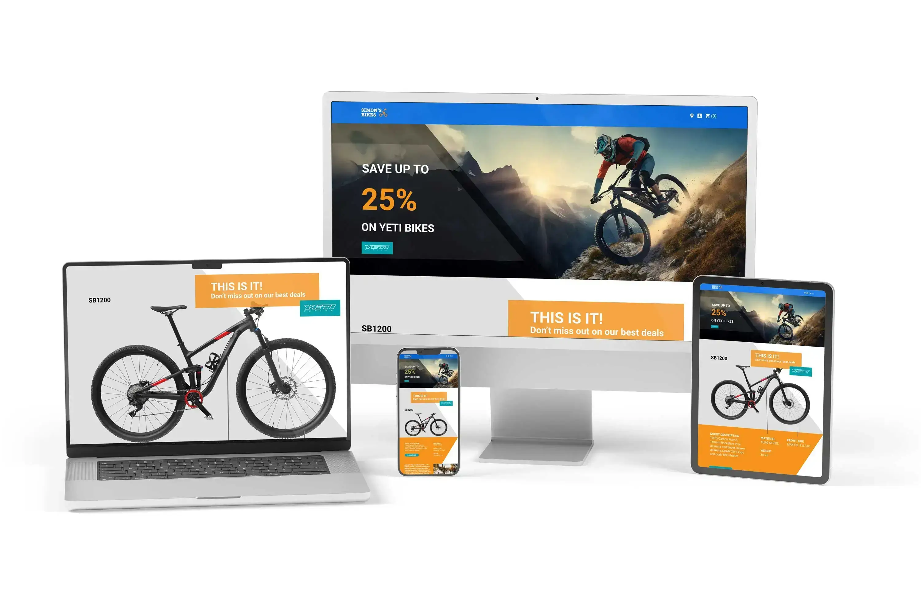
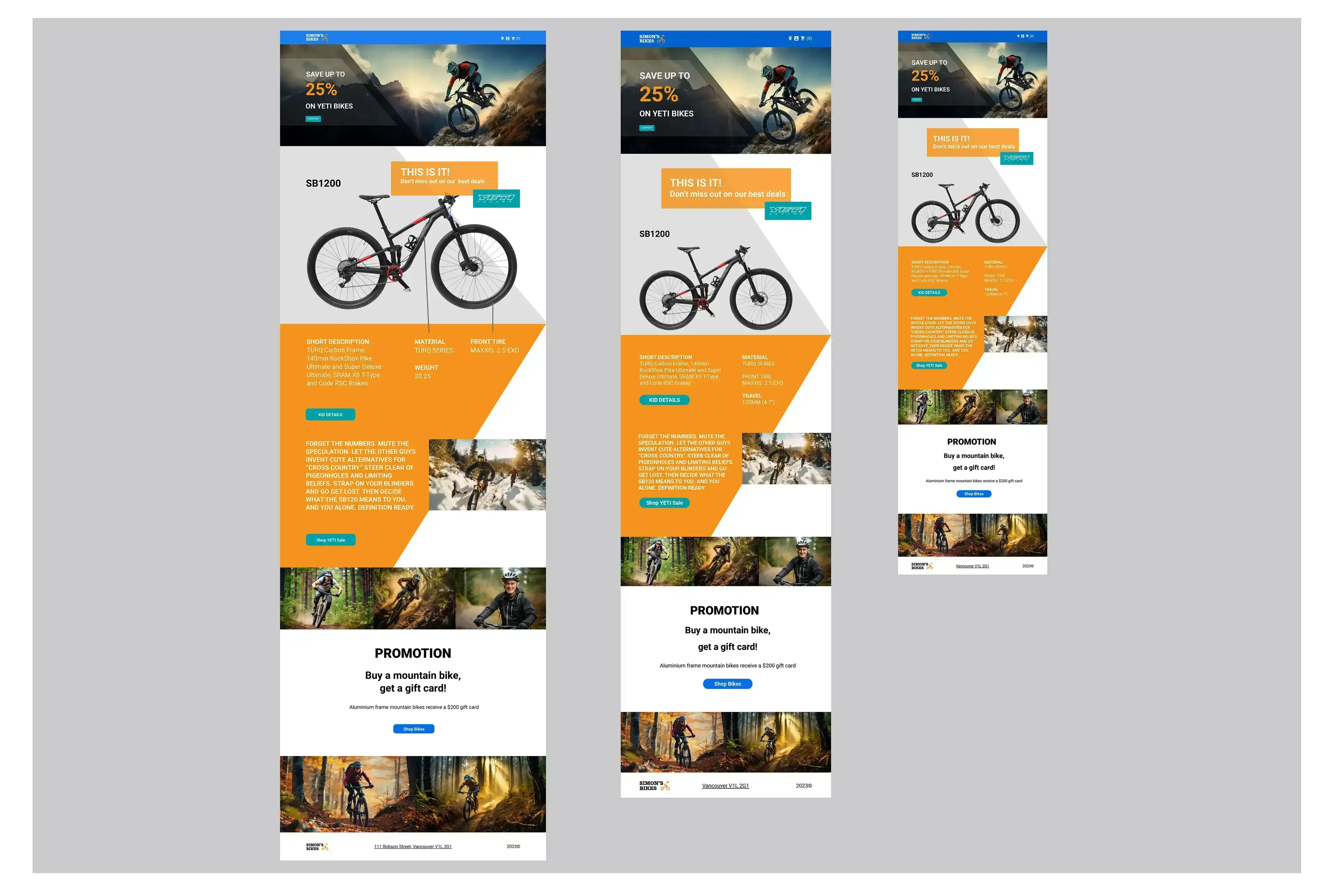
Their branding was outdated and not in a timely manner. My tasks included giving the store a new name, changing the logo and brand identity, creating graphic elements such as patterns, merchandise, stationery, and signage, designing a landing page, and developing social media assets.
Individual or group
Individual
Target audience
The primary target audience are both, local mountain bikers and global tourists, and this inspired the essence of the new brand image. I aimed to encapsulate the adventurous, passionate, friendly, local, authentic, and energetic spirit in the modernized image.
Projects constraints
My goal was to captivate the diverse mountain biker community during Simon’s Bike Store rebranding. Understanding their market and local competitors guided my design decisions.

How did I choose the details
New Brand Name
The new business name is concise and contemporary. The objective with this new name is to enhance memorability, resulting in a shorter and more user-friendly domain name. Customers generally prefer and find it easier to remember and type shorter domain names. Additionally, searching for a concise name on Google is more straightforward.
New Brand Story
They’re not just a shop; they’re curators of experiences, crafting a haven for the adventurous, the passionate, and the friendly souls who call their mountainous backyard home.
Logo Overview
Font Margot: This vintage, distinctive font injects a unique charm into the logo, reflecting the owner's individuality with a hint of retro style.
Helmet: Safety is paramount for Simon, symbolized by the inclusion of a helmet as a key element in the logo. Body: The letter "S" forms the body of the biker, representing Simon. Biker: Merging style with identity, the biker graphic seamlessly integrates the store's name.
Colour
Primary colour orange: In the context of our brand, orange represents the daring nature of mountain biking, catering to enthusiasts who embrace risk and exude extroverted and uninhibited energy.
Secondary colour blue. This color fosters a sense of reliability, establishing a foundation for building customer loyalty within our brand. We will use the secondary colour for ads, background colours, patterns etc.
Brand Font
The typeface Roboto was chosen for headings and subheadings because with it is friendly, web friendly and balance content density with reading comfort.
The typeface Lora was chosen for bodytext because it is a well-balanced contemporary serif with roots in calligraphy. It is a text typeface with moderate contrast well suited for body text.

Fulfillment of Requirements
I focused on creating a clear and attractive look for Simon's Bikes that connects well with their main customers. I chose colours, fonts, and graphics that work together and can connect with the people they want to reach. Overall, my design decisions achieved the goal of giving the brand a fresh look while keeping it familiar and appealing to a wider audience.