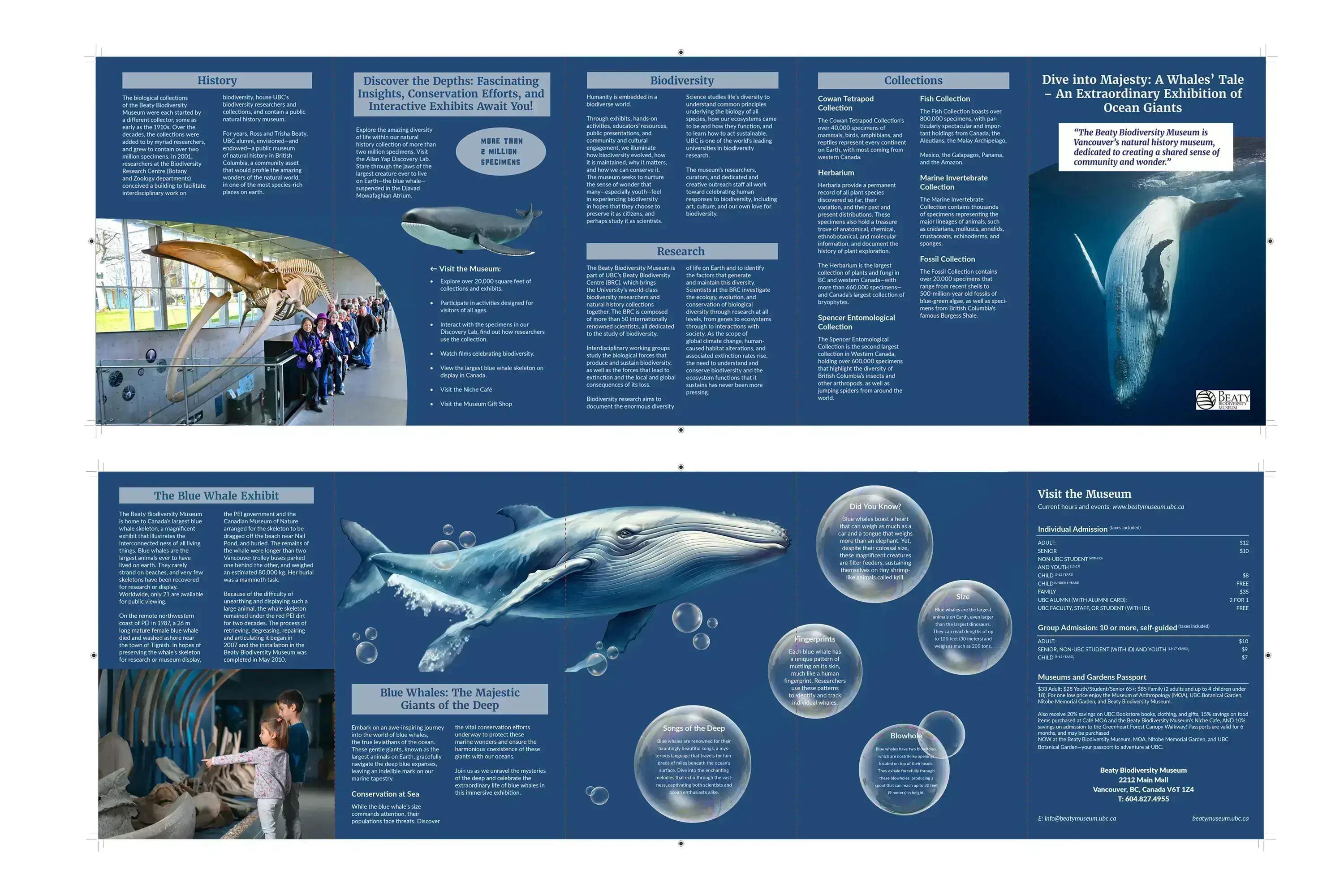
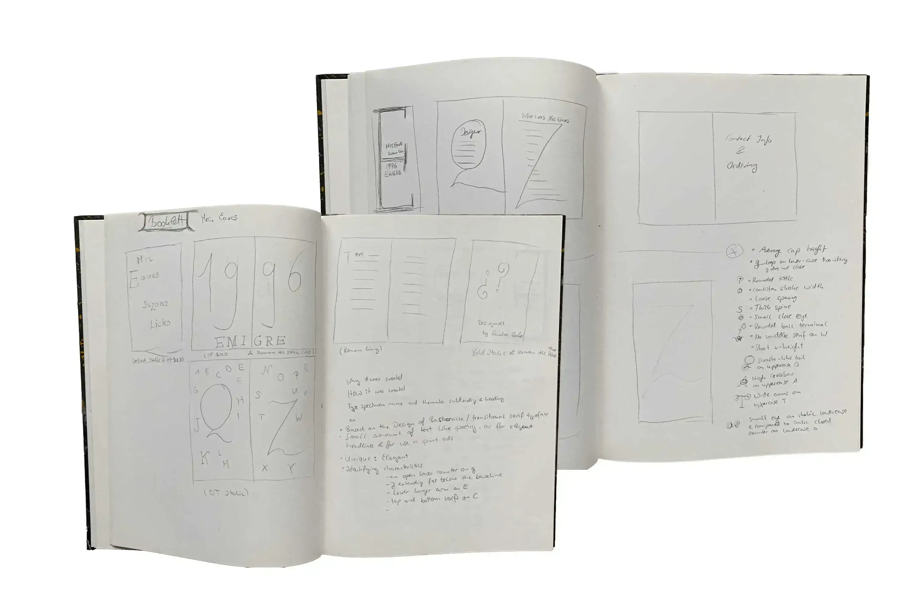
Print Designs

Logo InDesign Logo Photoshop Logo Illustrator Logo Figmar

Museum Project Overview

The Blue Whale Exhibition, a permanent display at the Beaty Museum, features Big Blue, Canada's largest blue whale skeleton. Transporting it from Prince Edward Island to UBC's campus was a challenging 6000 km journey, as these skeletons are rare and only 21 are available globally.

The exhibition illustrates the interconnectedness of nature and targets a diverse audience, including older individuals, busy families, and anyone intrigued by the fascinating world of blue whales.

  1. Design Challenge
  2. The design challenge was to organize all the content and images on the brochure.

  3. The images needed to appeal to a diverse audience, while the font had to be readable for older individuals yet interesting for the younger generation.

  1. Design Solution
  2. I opted for an accordion brochure with ample pages and a suitable width for a two-column format. This layout allows the reader to pause, rest their eyes, and absorb information more comfortably.

  3. Further details about font size and style will be provided in the design description.

  4. The images are a blend of museum photographs and AdobeStock photography.

Sketch of the Museum Brochure
Design Process

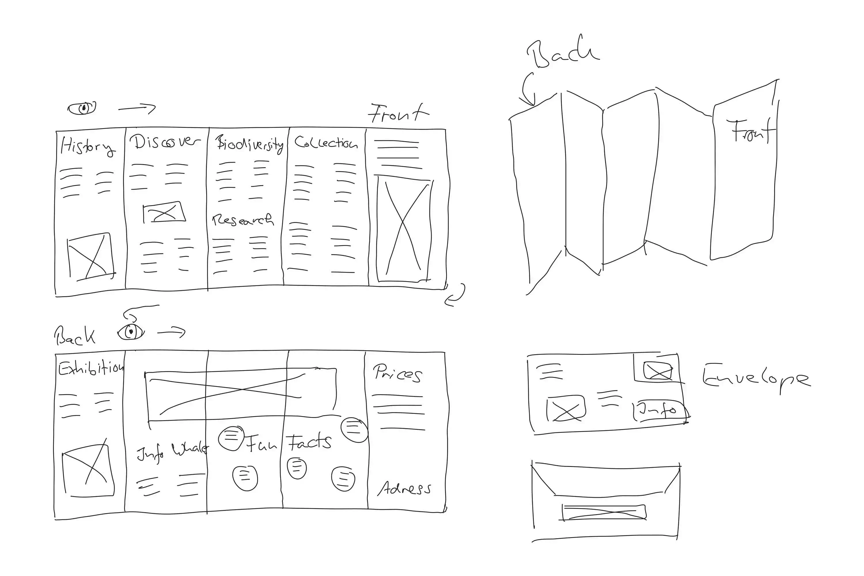
My design process began with a sketch of the brochure in Figma. I then created a mood board to gather inspiration for the images and fonts.

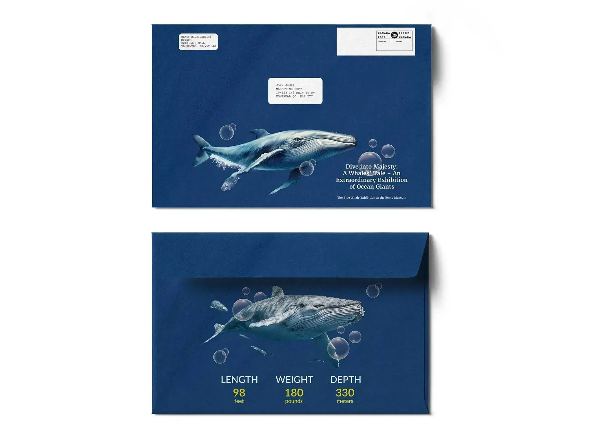
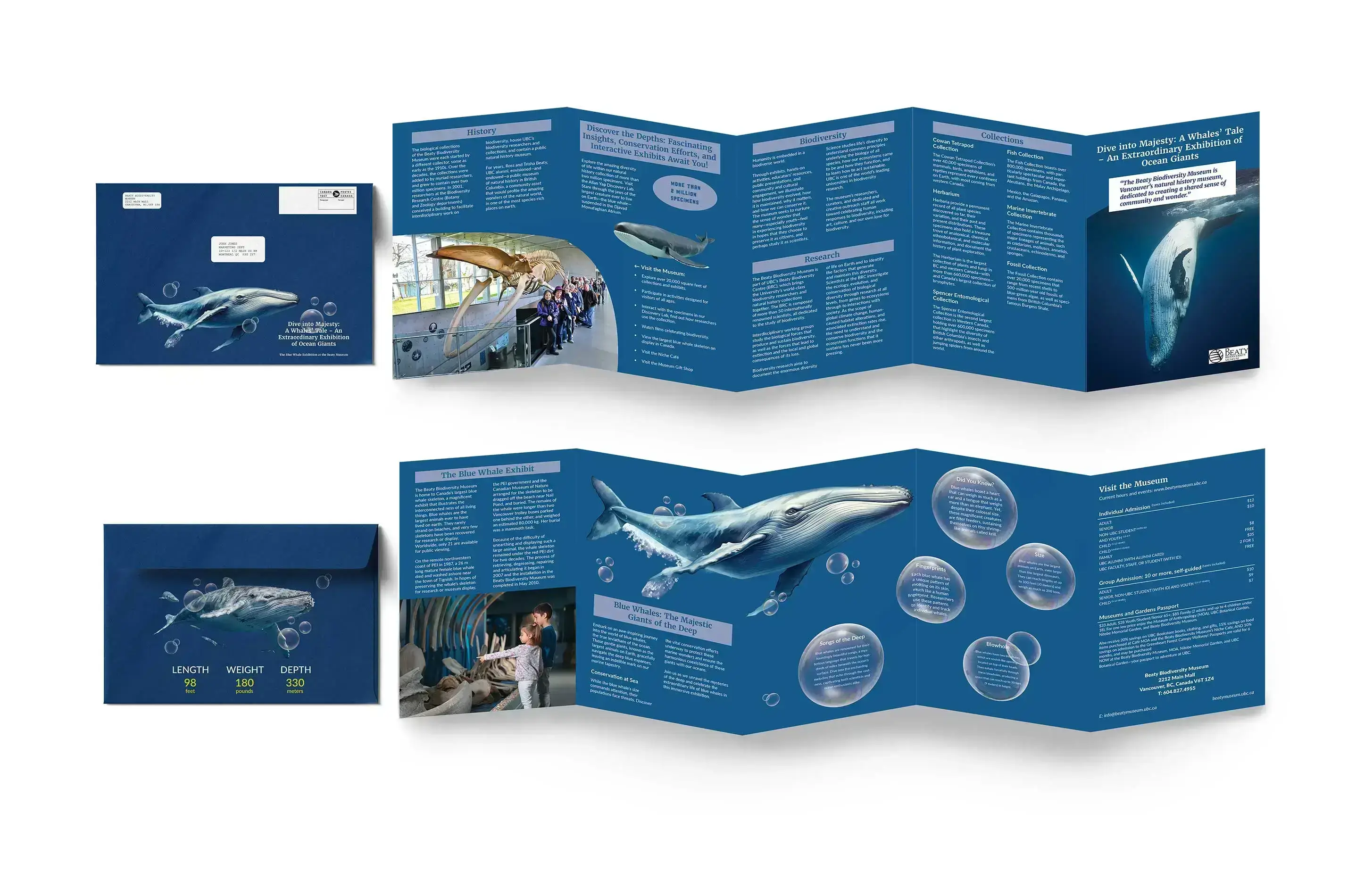
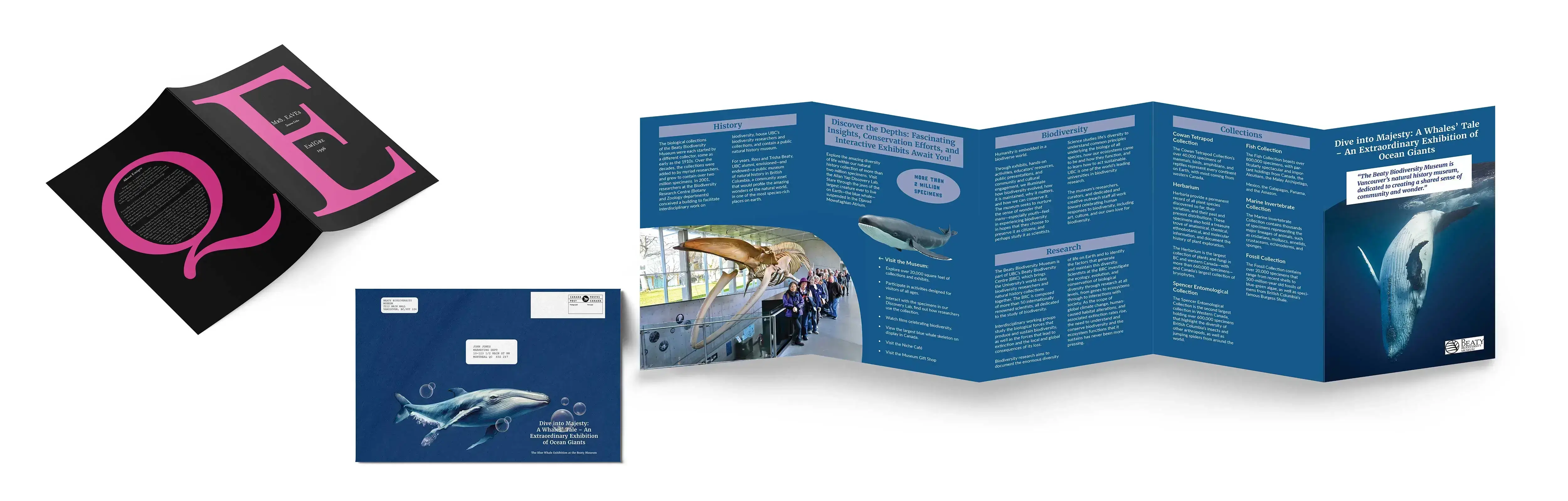
I aimed to craft a classic yet engaging layout, incorporating white space to prevent the reader from feeling overwhelmed by information and images. I also chose to design an envelope for mailing the brochure, including additional details about the whales and the exhibition. This approach is intended to pique the curiosity of the recipient.

Folding Guides for the Museum Brochure

I used Adobe InDesign to complete the design. I selected Merriweather for the headings and subheadings in the brochure. Its refined appearance and readability make it well-suited to draw attention and convey a classic aesthetic. To maintain clarity in the body text, I opted for Lato. Its clean and modern design ensures the content is presented with a professional yet approachable tone throughout the brochure.

Chose a 10 pt font size for the body text to ensure easy readability, especially for an older audience.

Used bubbles for fun facts about Whales to add interest and liven up the design. Employed uppercase and hanging indents in the price-list for a clean and readable layout. Incorporated the colour blue, the Beauty Museums brand colour, for a cohesive and branded look.

Envelopes for the Museum Brochure
Envelope Design

For the envelope, I used the same font and colour scheme as the brochure to maintain a visual language. I included a blue whale illustration to add visual interest and to hint at the content inside.

The envelope is designed to be mail-friendly and to protect the brochure during transit. The front of the envelope includes a brief description of the exhibition and the museum's contact information. The back includes information about the whale.

What I've learned

Designing the brochure for the Beaty Museum was a challenging yet rewarding project. I learned how to create a cohesive and engaging visual narrative that effectively communicated the museum's rich collection and mission. This experience enhanced my skills in graphic design, layout, and content creation, showcasing my ability to balance creativity with the strategic goals of the project.

Museum Brochure Mockup
Top

Specimen Booklet

This specimen booklet was created for designers seeking a classy font suitable for various applications such as CD covers, product packaging (perfumes, creams, soaps, chips), poetry books, regular books, and restaurant menus.The font I used is "Mrs. Eves from Suzana Licko," and it brings an elegant touch to short bits of text. This project highlights my commitment to creating stylish designs for different things.

  1. Design Challenge
  2. Choosing six fonts from a single typeface was quite a task. I had to strike a balance, maintaining a common theme among them while allowing each font to showcase its individual style. Crafting a visually pleasing layout that didn't overshadow the design became vital.

  3. Navigating through the challenge of getting the colours just right for print added another layer.

  4. Juggling this delicate balance between staying consistent and letting each font shine in the print realm made this design journey both challenging and satisfying.

  1. Design Solution
  2. I went for a mysterious black backdrop to enrich the story of the real Mrs. Eaves, highlighted the Lady in an alluring shade of pink, and used white for sharp text contrast and clarity. Keeping the palette to these three colours was my way of ensuring no distractions, keeping the reader fully immersed in the experience.

  3. Additional information regarding font size, usage, and style will be outlined in the design description.

Sketches specimen booklet
Design Process

I began by researching Suzana Licko and the Mrs. Eaves font family to gather insights. As I delved into the details, ideas for presenting the font family in a booklet started flowing.

The next step involved putting pencil to paper, where I sketched various versions, explored different layouts, and refined my concepts.

Specimen Booklet Cover

For the front and back covers, I chose to feature one letter each, strategically designing them as the entry and exit points. Opting for the letter "E" allowed me to incorporate the font, designer's name, company, and year in a cohesive manner on the top and under the bar. The unique long swash of the letter "Q" became the focal point for showcasing information about the company Emigre at the end of the booklet.

Specimen Booklet Page Two and Three

I followed established design principles by employing a bold font for headings and subheadings. However, on pages two and three, I strategically transitioned to Italic Bold to enhance the presentation of the Lady and underscore the typeface's elegance.

The body text is presented in an Italic font, complemented by a touch of pink for added visual appeal.

To emphasize unique features, I utilized All Small Caps for headings, ensuring they stand out and capture attention.

Specimen Booklet Page Four and Five

I chose All Small Caps for the headings of the unique features to make them stand out. This way, the reader can easily focus on each feature's distinctiveness. Using Regular/Italic or italic bold might have made the headings less noticeable on the pages.

I intentionally made the font's unique features larger with white space around them, so readers can concentrate on the special qualities of each letter.

Specimen Booklet Page Six and Seven

In addressing the challenge of organizing ordering and product information on the penultimate page, I strategically divided the content to enhance readability.

What I've learned

This project taught me to balance fonts, making sure they match but also stand out. Picking six different fonts from one family made me carefully think about when to use each one. It also showed me how important it is to plan the layout and organize information in a way that's easy to understand.

Choosing colours and styles with purpose made a big difference in making the design look elegant and telling a story.

Overall, I've realized the importance of intentional design that fits the story and goals of the specimen booklet.

Specimen Booklet Mockup
Arrow left back Top Arrow right forward