
Branding Pediatric Dentistry


Project Overview
I was tasked with branding a new business in the historic East Village, formerly known as Hastings Sunrise, one of Vancouver's oldest and most charming neighborhoods. I chose to create a brand for a pediatric dentistry clinic from the ground up.
What I did
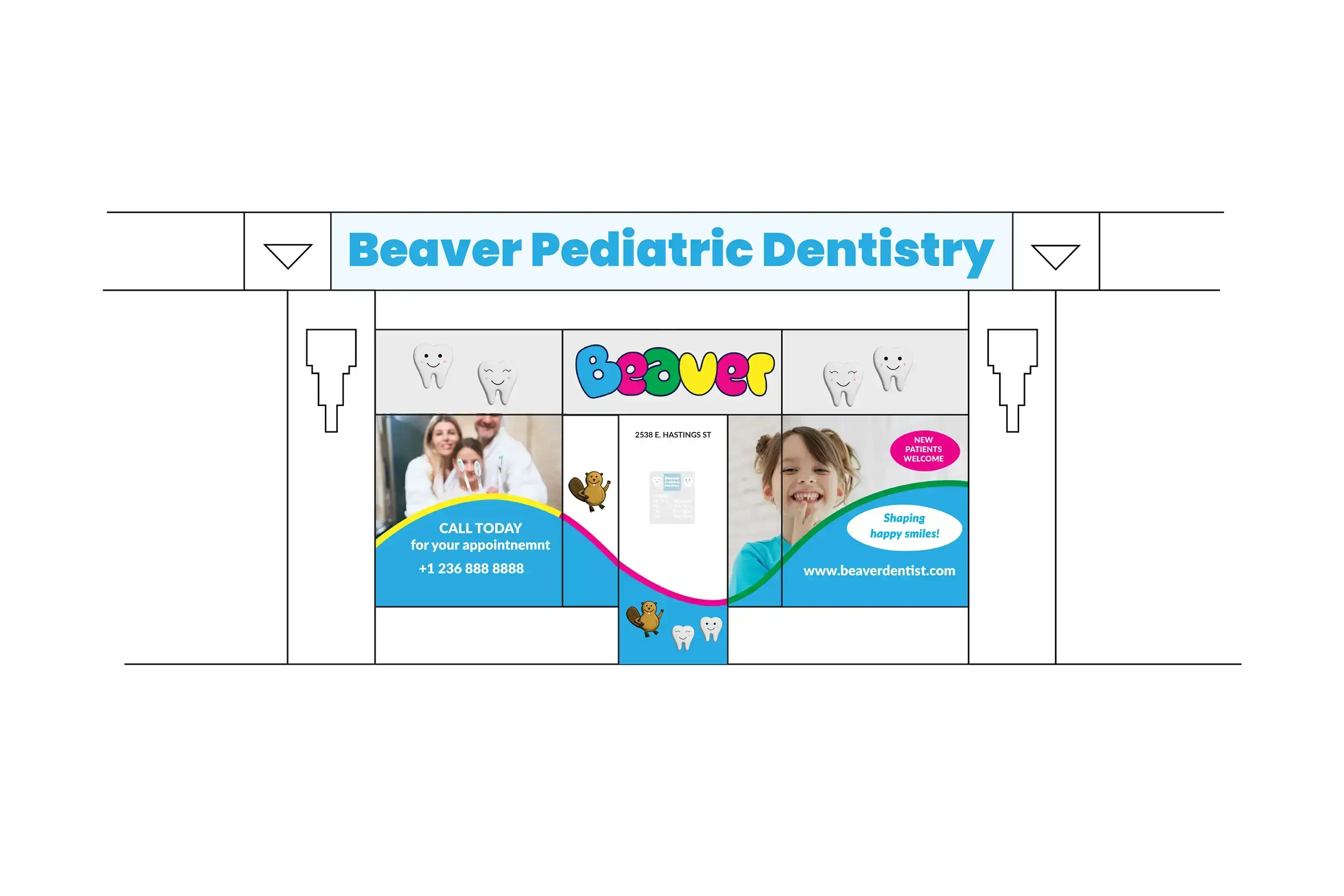
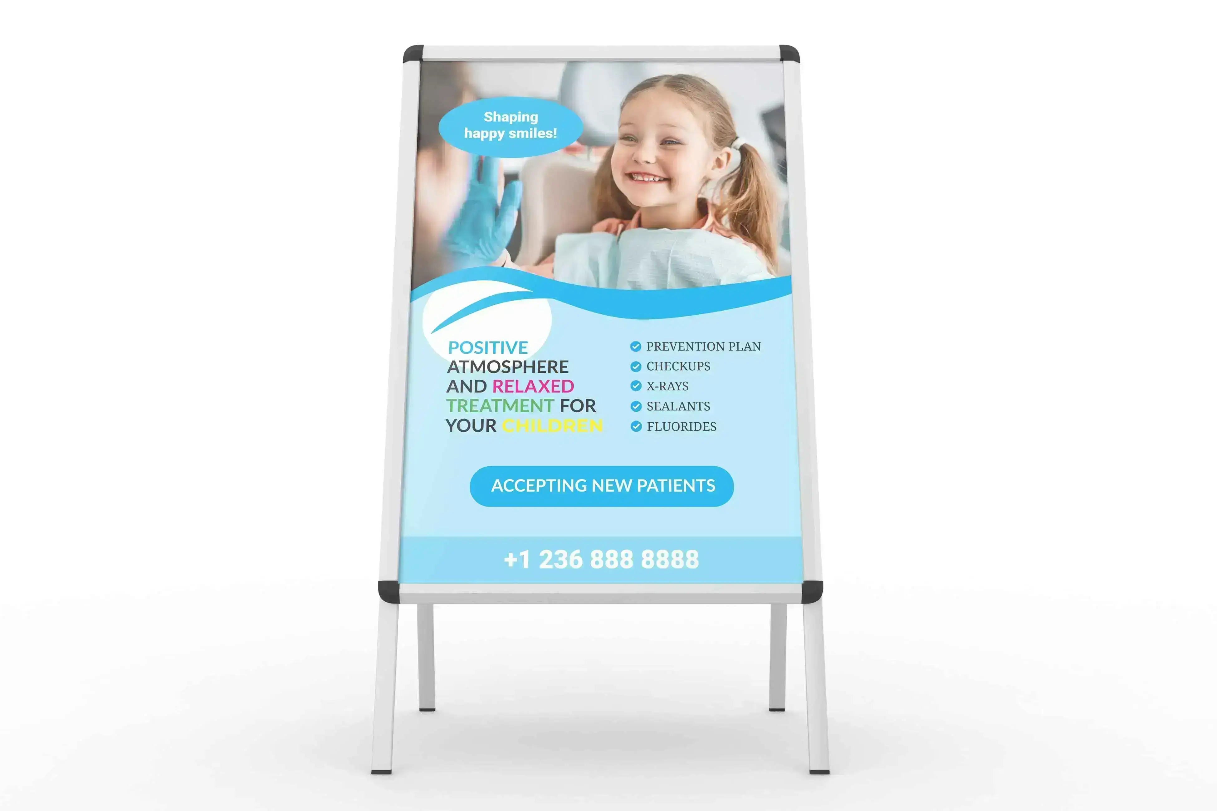
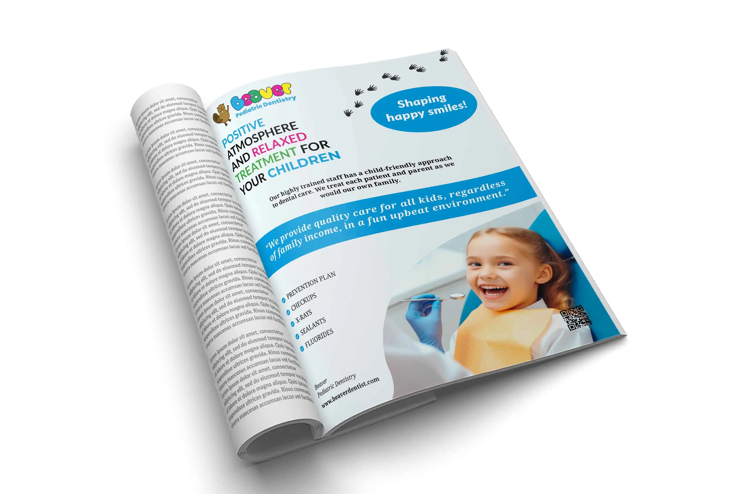
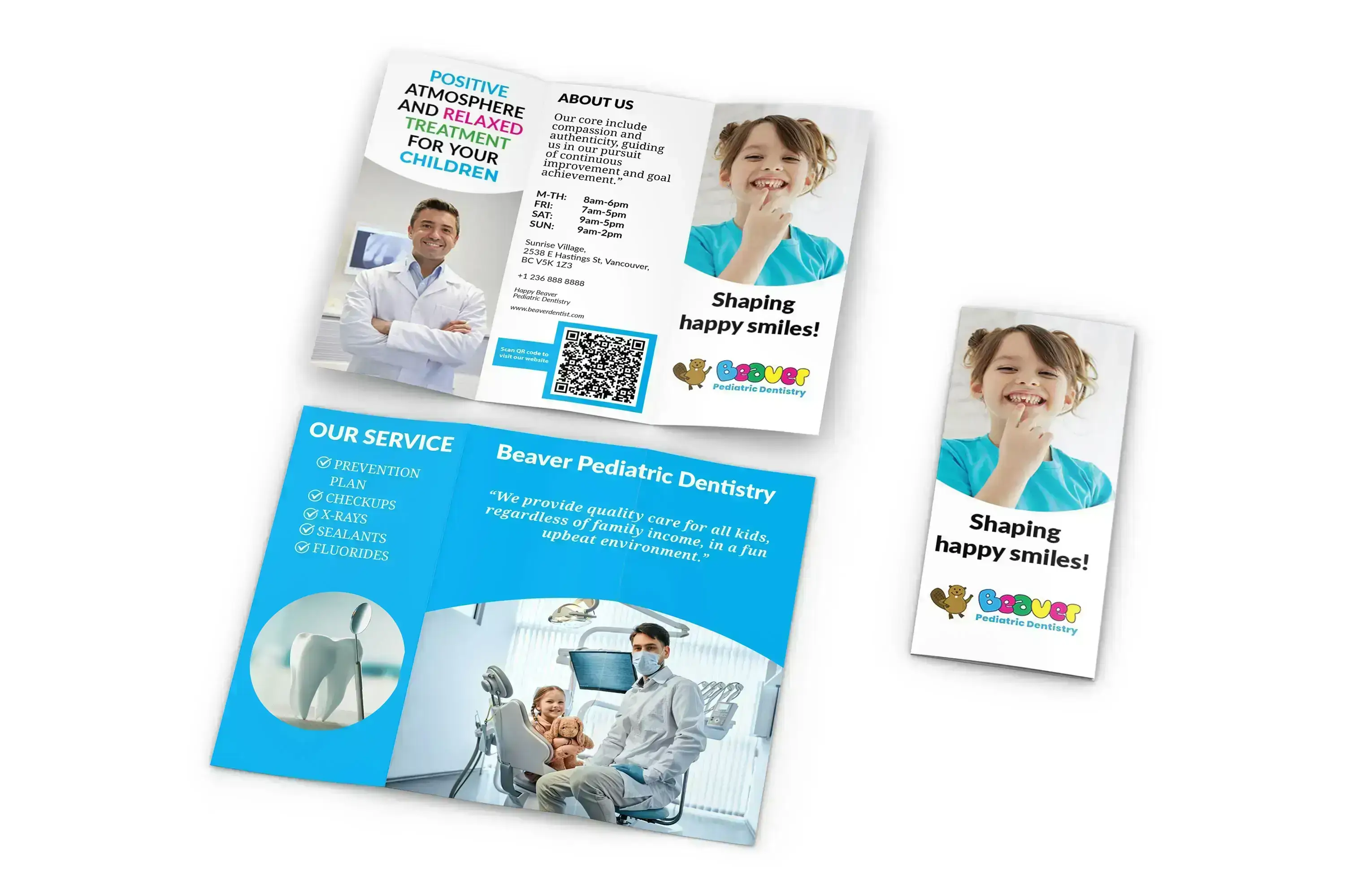
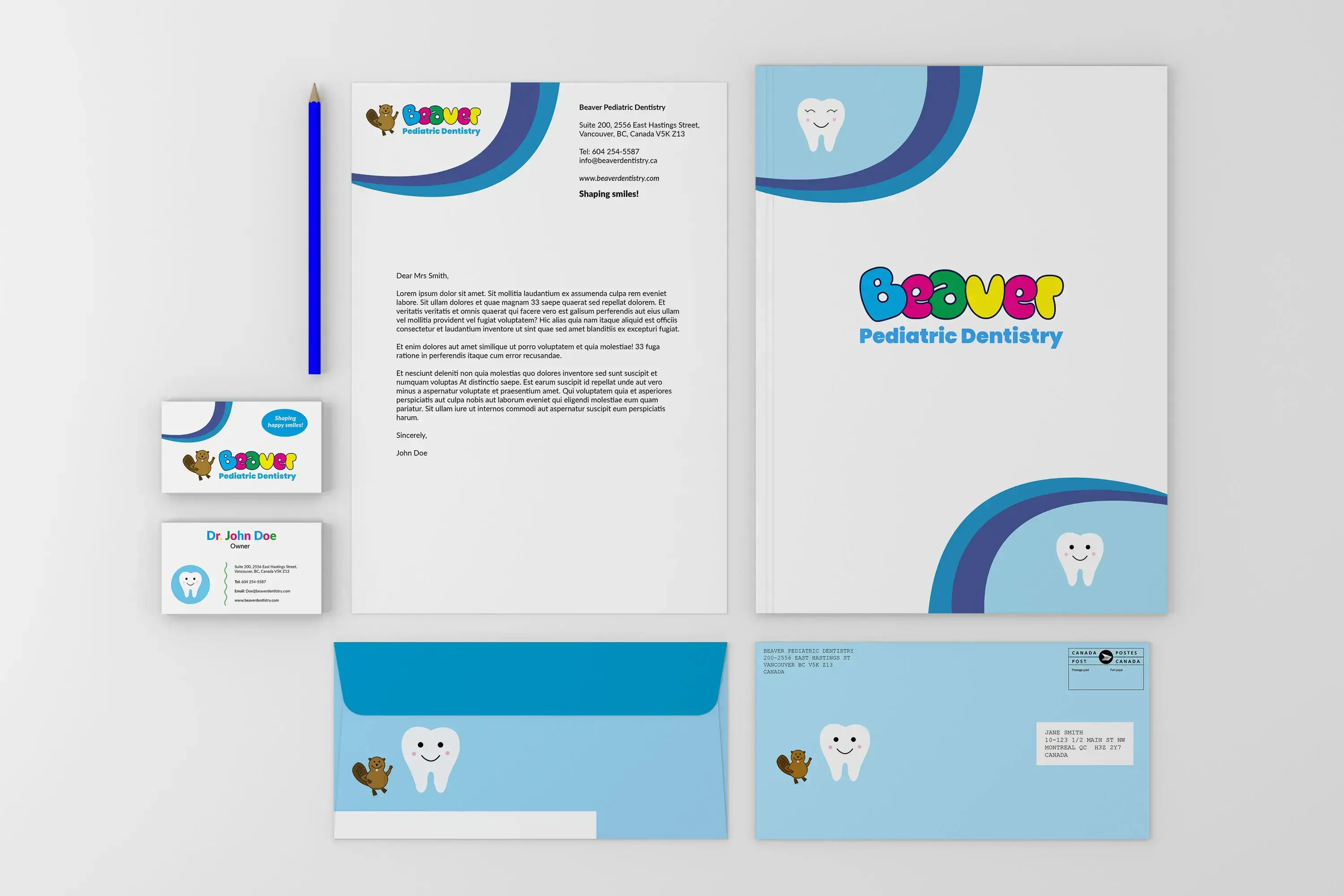
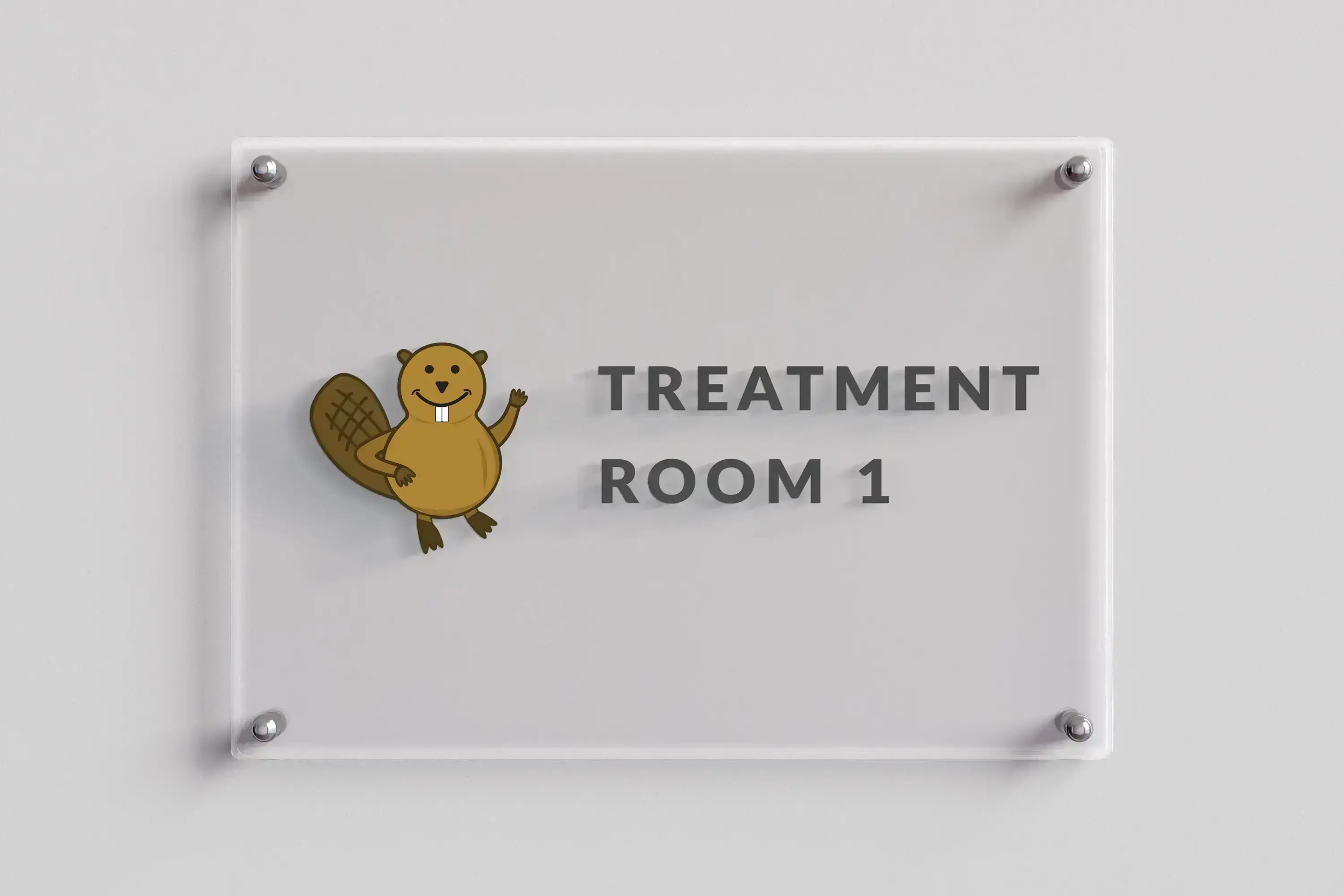
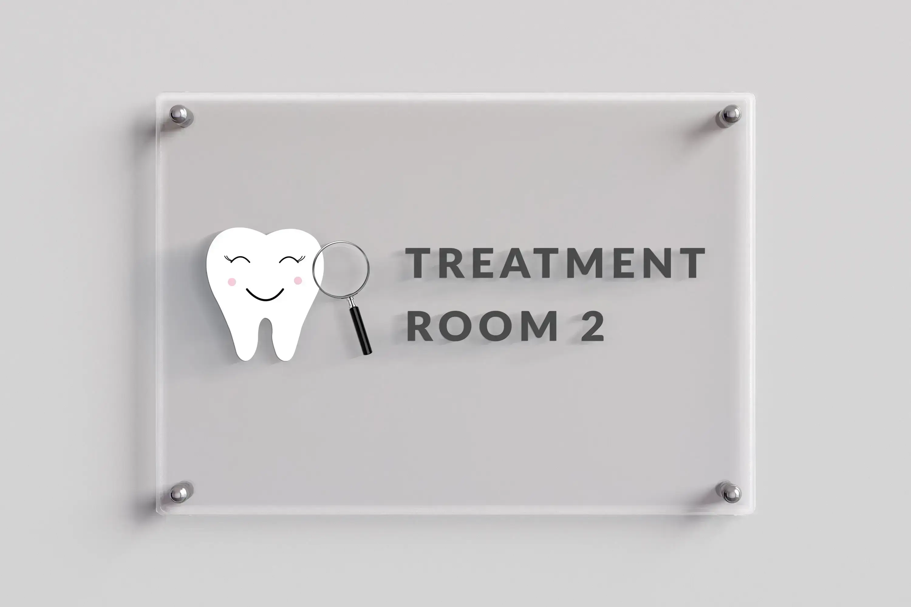
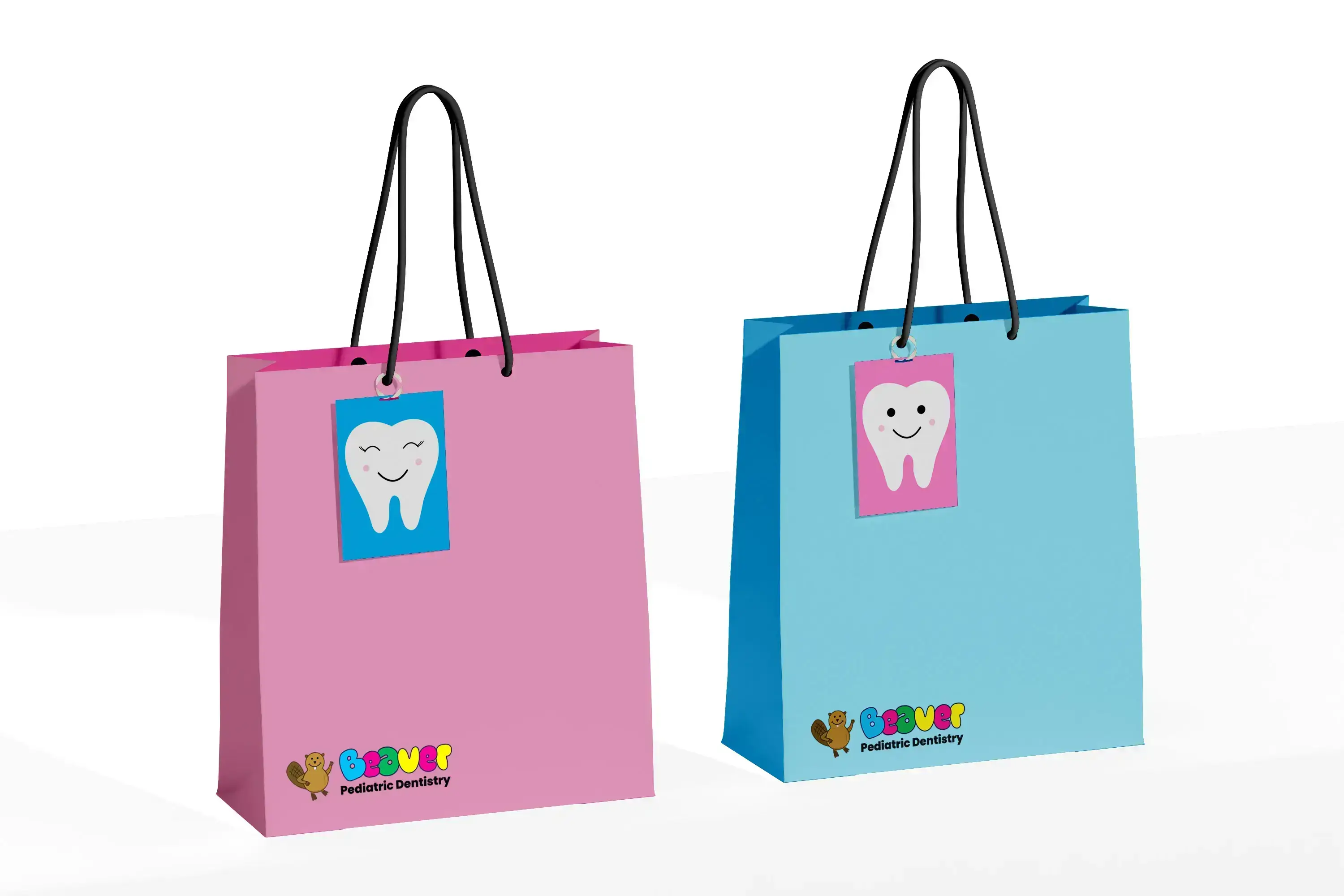
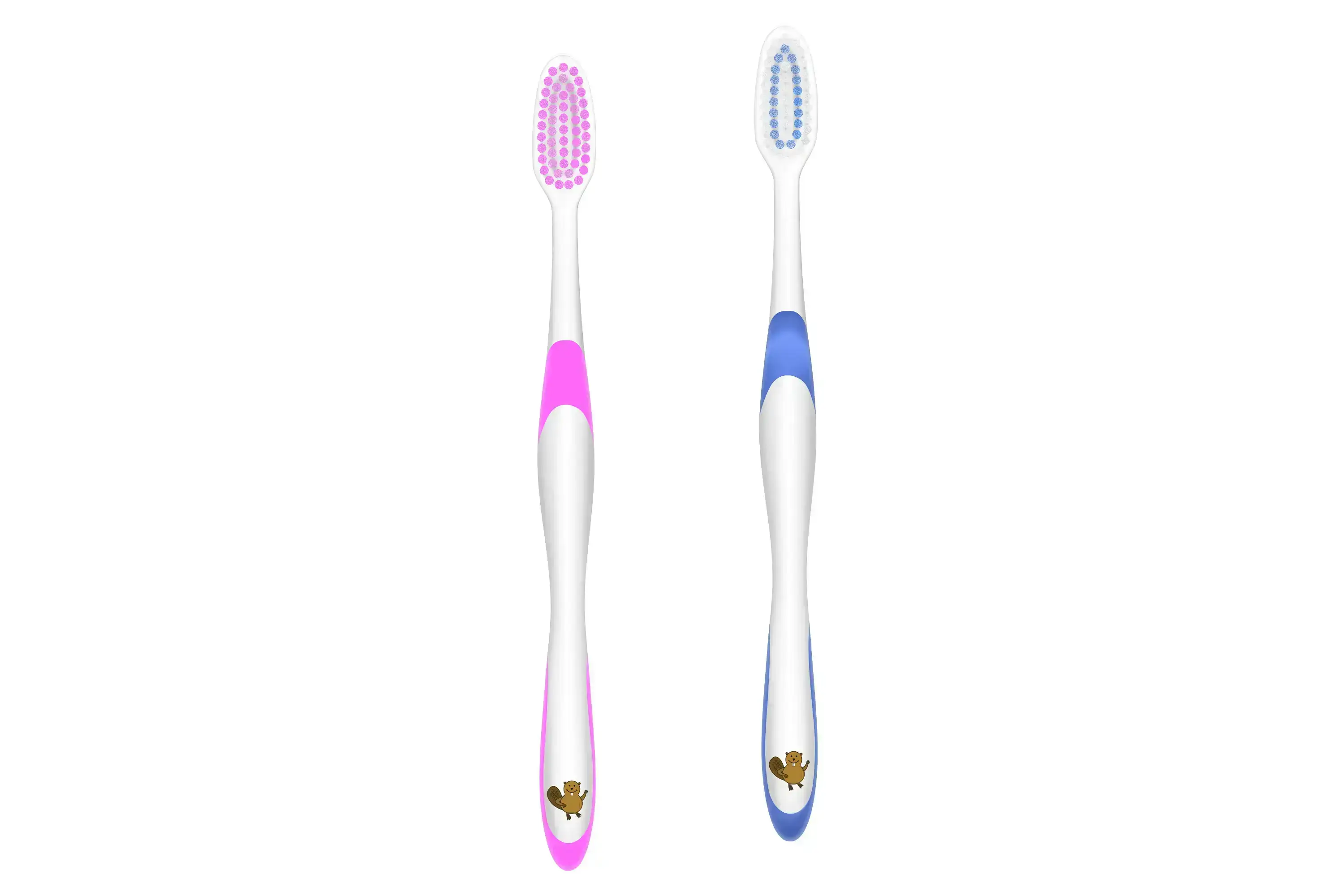
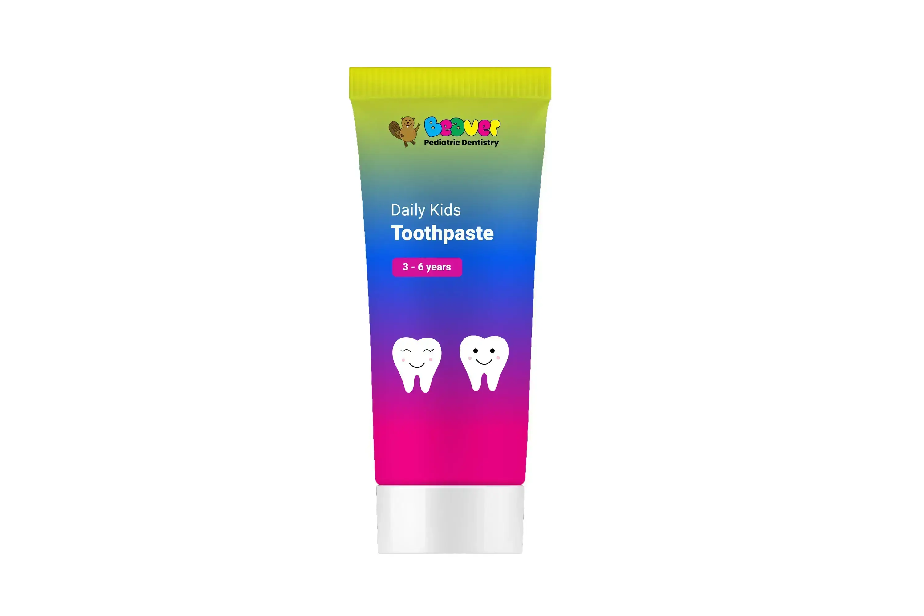
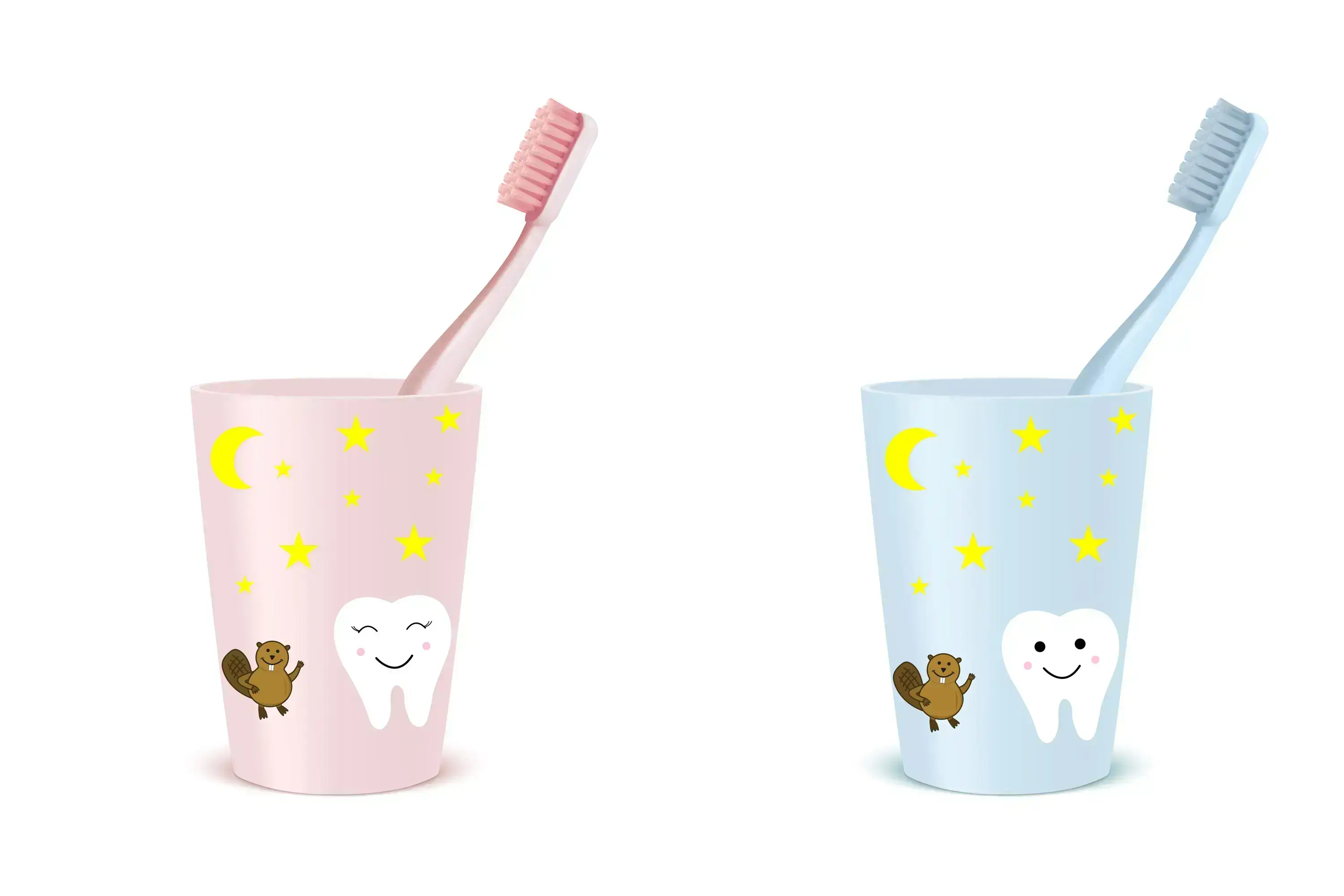
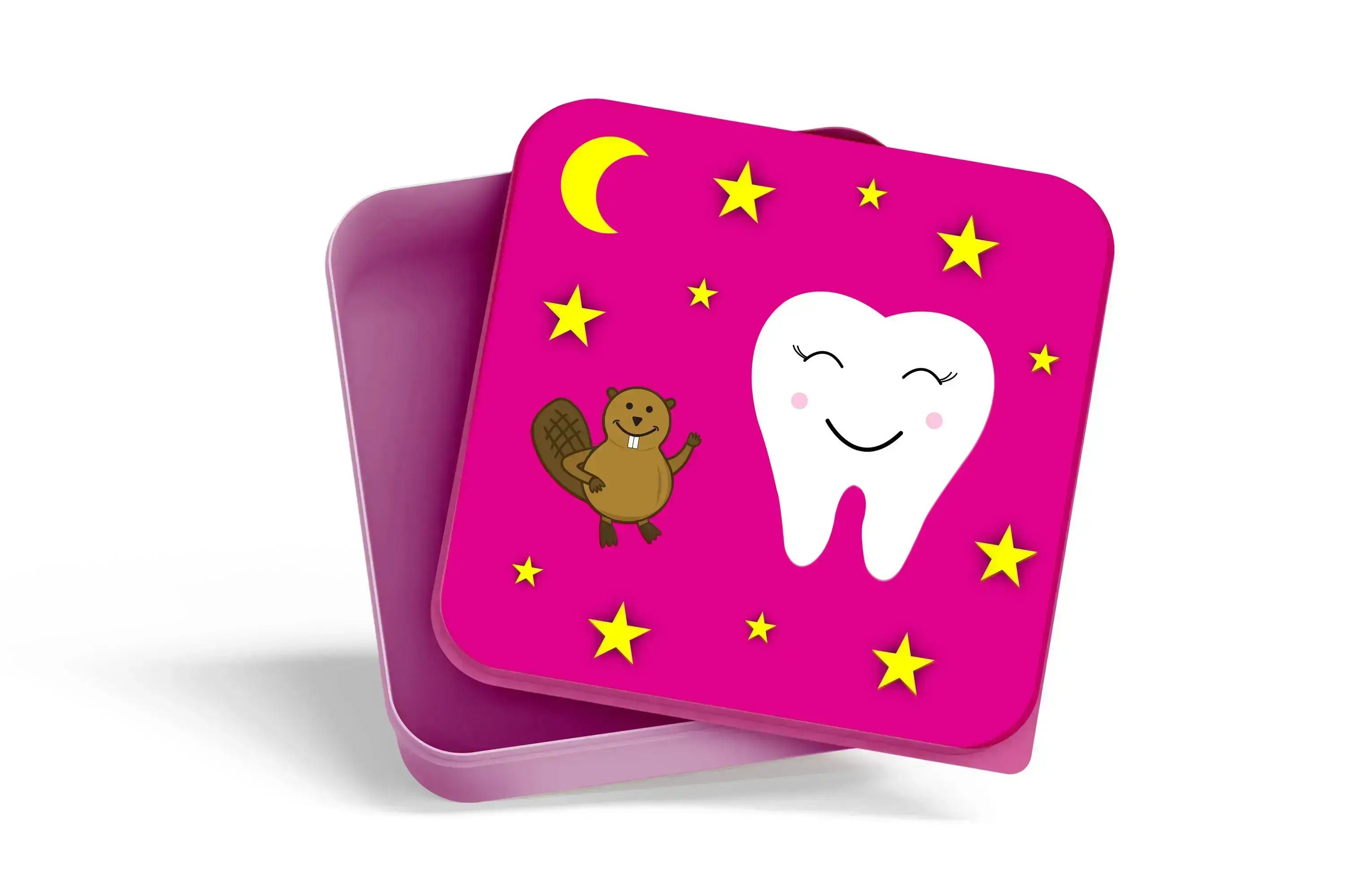
My responsibilities involved naming the clinic, designing the logo and brand identity, creating graphic elements like patterns, merchandise, stationery, signage, storefront design, a brand house, and a customer kit.
Target Audience
The primary target audience are parents bringing their children to pediatric dentistry.
It is
important for them to feel that
their kids would enjoy going to the dentist, feel safe, and perceive the clinic as friendly and
professional.
Projects Constraints
My objective was for parents to be attracted by the professionalism and friendly atmosphere conveyed by the brand, while ensuring that children feel happy and safe when they see the logo.
How did I choose the details
Brand Name
I selected the beaver as my business name because it's friendly, a common Canadian animal with distinctive long teeth. The challenge was avoiding a too-childish look for the beaver. The logo is designed to initially appeal to parents and then create a friendly, welcoming feeling for children.
Logo Overview
I created a simple and engaging logo of a beaver, with colourful, big bubble font for "Beaver" to attract children, while using clear blue font for "Pediatric Dentistry" to provide a professional look for parents. Additionally, a wordmark logo was designed for official documents.
Colour
I researched colours that bring joy to children, aiming to create a happy environment. Positive emotion colours for children include yellow, blue, green, and pink. The goal is to make children happy, which makes their parents happy. The primary colour is blue and the secondary colour yellow.
Font
I used the "Loving Snow Trail" font for a playful and bubbly look in the beaver logo, while "Poppins" was chosen for a friendly, yet professional expression, both in the primary logo for "Pediatric Dentistry" and as the wordmark logo.

Fulfillment of Requirements
I strived to create a clear, friendly, and appealing appearance for Pediatric Dentistry that resonates with both children and their parents. I selected colours, fonts, and graphics that complement each other and engage the target audience effectively. In summary, my design choices successfully met the goal of giving the brand a friendly and distinctive look, striking a balance that is not overly childish.